
Calming colors like soft blues, muted greens, and warm neutrals are becoming increasingly popular for home interiors. Here’s an in-depth look at why these soothing hues are trending.
The Stress-Reducing Benefits of Calm Colors
In our fast-paced modern world, people are seeking ways to find more calm and relaxation in their lives. Using calming colors in interior design can help create a peaceful sanctuary right at home. Here are some of the top reasons these hues have stress-reducing benefits:
- Promote feelings of tranquility – Cooler, muted colors like sage green and sky blue naturally promote tranquility and relaxation in a space. They have a lower wavelength on the color spectrum which translates into a calming effect.
- Lower heart rate and blood pressure – Studies show being surrounded by calming colors can lower heart rate and systolic blood pressure, easing stress levels. Soft blue-greens are especially effective at promoting relaxation.
- Enhance focus – Calm colors don’t overstimulate so they aid concentration and focus. Using them in home offices or kids’ rooms helps avoid restlessness and distraction.
- Encourage restful sleep – Colors like lavender and seafoam green encourage restful shuteye. Using them in bedrooms helps you drift off to sleep more easily.
- Provide comfort – Neutrals like warm taupes, creams, and tans have an innate comforting quality. Their soft, welcoming vibe helps rooms feel cozy and tranquil.
So by incorporating relaxing hues you can transform your home into a relaxing oasis away from the stresses of everyday life.
The Move Towards Mindfulness and Wellness
The growing trend towards mindfulness, tranquility, and wellness in recent years has also contributed to the rising popularity of calming colors. With society’s increasing focus on finding inner calm and peace, creating a soothing environment at home with restful hues provides a tangible way to support this goal of greater mindfulness.
Some key ways this movement has fueled the calming color trend include:
- Focus on mental health – With anxiety, depression, and other mental health issues on the rise, people are looking for ways to cultivate daily tranquility. Calm colors foster relaxation and lower stress to aid mental well-being.
- Trying meditation and yoga – As meditation and yoga move into the mainstream, calming interiors provide a perfect backdrop to support these practices. Serene spaces enhance concentration and inner calm.
- Seeking simplicity and decluttering – Adopting a minimalist lifestyle with less clutter and distraction requires soothing surroundings where one can focus. Calm hues help evoke this simplicity.
- Practicing self-care routines – For people implementing evening baths, morning stretches, and other self-care habits, a calming color palette helps set the tone for rest, rejuvenation, and personal replenishment.
- Focus on natural elements – From biophilic design to sustainable materials, nature is a prominent wellness influencer. Earthy calming colors like sage green and sky blue reflect this organic trend.
The calmative quality of muted, lighter hues perfectly complements the modern emphasis on mindfulness, simplicity and self-care.
Psychology of Color in Design
Delving into the psychology behind our color choices reveals practical reasons why calming shades feel especially fitting for current interior design approaches.
Cooler Palettes for Relaxation
On the color wheel, hues ranging from greens and blues to violets have a calming, centering effect. The tranquil psychology of color for these palettes includes:
- Naturally soothing – We intrinsically associate cooler tones with calming elements like water, sky, and grass. Using blues and greens taps into this innate relaxing quality.
- Reduce stimulation – Cooler colors have lower color wavelengths that don’t overstimulate our senses. Keeping visual input gentle is calming.
- Suggest distance – The way our eyes focus to see cooler colors gives the impression of distance and openness – great for creating a spacious, relaxing ambiance.
- Promote introspection – Blues and greens turn our thoughts inward to personal reflection rather than stimulating extroverted excitement.
Warm Neutrals for Comfort
On the opposite side of the color wheel, warm neutrals like tans, taupes and beiges also create a comforting, tranquil effect. The cozy color psychology includes:
- Subtle and soothing – Paler neutrals don’t overpower a space, providing subtle soothing backgrounds people find comforting.
- Connection to nature – Natural tan and earthen shades link back to sand, wood, and stone for familiar coziness.
- Feel familiar – Warm natural neutrals unconsciously feel familiar – reminding us of welcoming elements like bread, hot tea, and cookies.
- Provide a blank slate – Soft neutral backgrounds feel serene on their own and provide a calming blank slate to layer in pops of color.
Avoiding Stimulating Shades
On the opposite end of the spectrum, colors like bright reds, oranges, and neon tones all have an energizing psychology of color. Avoiding these stimulating shades in favor of calmer hues helps create relaxation.
- Increase energy – Bright warm colors inherently elevate emotions, energy, conversation, and stimulation – all useful in moderation but not for calm.
- Advance visually – Warm intense colors appear to come forward visually, creating too much visual movement and distraction for serenity.
- Increase appetite – Hues like orange and red unconsciously stimulate our appetite – great for dining rooms but not serene bedrooms.
- Increase perspiration – Studies show warmer colors slightly raise body temperature and perspiration, which can make them feel agitating.
By steering clear of overstimulating shades, you avoid one of the pitfalls in choosing colors and create a more relaxing effect.
Calm Color Palettes for Interiors
Now that we’ve explored why calming colors encourage relaxation and their soothing psychological qualities, here are some of the most popular tranquil palettes to use in interior spaces:
Soothing Blues
Ranging from pale sky blue to deeper denim tones, blue is one of the quintessential colors for evoking serenity.
- Sky blue – This pale, ethereal shade instantly conjures images of peaceful, expansive skies. Use it in bedrooms.
- Powder blue – With barely a hint of color, this extremely pale blue reads as a neutral while still feeling airy.
- Periwinkle blue – With a crisp, cool vibe, this bluish-purple offers a bolder yet still calming blue option.
- Cadet blue – A greyish midnight blue, this adaptable hue adds peaceful ambiance without overwhelming.
- Navy blue – As a calming neutral, navy works well as an accent wall or grounding anchor color.
Soothing Greens
Ranging from yellow-greens to bluish-greens, transitional nature hues offer an inherently peaceful effect.
- Sage green – The iconic calming green, this grayish hue instantly evokes healing sages and soothing herbs.
- Seafoam green – A pale mix of green and blue, seafoam conjures up images of soft ocean waves and water.
- Mint green – Crisp and cool but more spirited than blue, mint green offers lively tranquility.
- Forest green – Deep and woodsy yet still serene, forest green connects to the calming essence of nature.
- Olive green – One of the most versatile neutrals, olive green provides an earthy calm vibe.
Warm Neutral Tones
Ranging from soft whites to earthy taupes and tans, these cozy neutrals promote deep relaxation.
- Eggshell white – This extremely pale off-white feels brighter than harsh white for a subtle neutral backdrop.
- Oatmeal – A warm peachy-tan, oatmeal has a comforting, wholesome aura perfect for bedrooms or living rooms.
- Beige – As a light brown with yellow undertones, beige provides an approachable neutral foundation.
- Taupe – Mixing gray and brown, this neutral adapts well to any space while feeling inherently calming.
- Khaki – With a greenish-tan hue, khaki offers a soothing, casual neutral option.
By selecting colors from these palettes for your home, you can create a harmony of calming hues in your design.
Using Calm Colors by Room
Calming shades will set a relaxed mood anywhere in your home but are especially impactful in rooms where you want to unwind and restore. Here are tips for using soothing colors in key areas:
Bedrooms
Since the bedroom is where we start and end each day, it’s important it feels like a calming sanctuary. Create a restful retreat with:
- Soft blue accent wall
- Pale green and ivory bedding
- Neutral taupe walls
- Powder blue curtains
- White furniture with blue-green decorative pillows
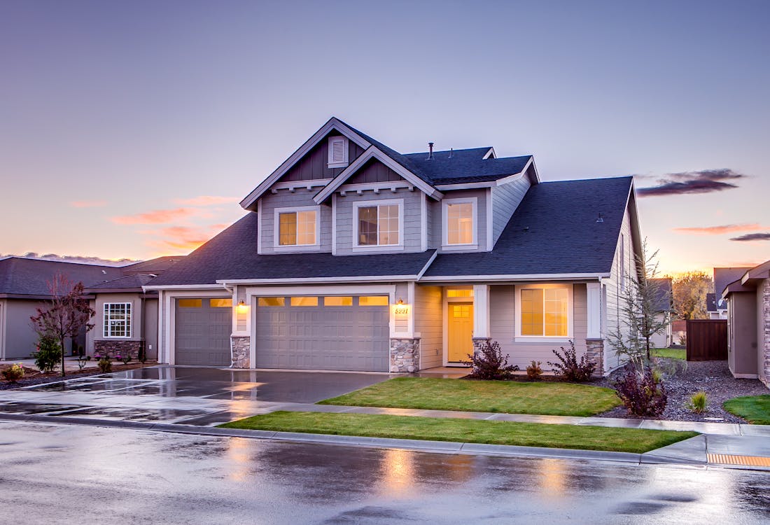
Photo from Pexels
Bathrooms
After a long stressful day there’s nothing more rejuvenating than a calming bath. Set the mood with:
- Seafoam green tiles
- White tub and sink
- Sage green towels
- Neutral tan walls
- Mirror frame in sky blue
Photo from Pexels
Home Office
An excessively stimulating workspace can sabotage productivity. Stay focused with:
- Pale blue or green walls
- White desk and bookshelves
- Navy blue desk accessories
- Leafy green accent art
- Neutral patterned area rug
Photo from Pexels
Living Rooms
Your living room should invite relaxation. Create an inviting space with:
- Seafoam green sofa
- Earthy jute area rug
- Creamy beige walls
- Olive green curtains
- Wood tone coffee table

Photo from Pexels
Creating Calmness with Color
Incorporating calming colors allows you to transform any space into a personal sanctuary from stress. As our desire for mindfulness, simplicity, and relaxation grows, using shades like soothing blues, verdant greens, and warm neutrals offers an impactful way to evoke peacefulness through design.
The next time you feel your rooms need a sense of tranquility, look at embracing this growing trend towards calmer hues. Your home can become a relaxing haven away from the stimulation of the world outside.
Frequently Asked Questions About Calming Colors
Why are blue and green considered calming colors?
On the color wheel, blue and green fall on the cooler, more serene side. Their lower color wavelengths are intrinsically less stimulating and associated with calming nature, helping evoke feelings of tranquility.
What is the most calming color for walls?
Very pale shades of blue-green like airy seafoam or a light sky blue are often considered the most calming wall colors. Their soft hues don’t overwhelm a space.
What is a good calming neutral color?
Warm neutrals like creamy tans, oatmeal, light taupe, and pale beige are excellent calming neutral choices. Their subtle earthy vibe feels cozy versus overstimulating.
Should I avoid bright colors for a calm space?
It’s fine to incorporate some bright pops of color, but bright hues should be used sparingly. Sticking mostly to muted calming shades prevents an overly stimulating effect.
What color carpet is most calming?
Light muted blues, sage greens, and pale neutrals like oatmeal or ivory work well for calming carpets. Avoid bold reds or oranges. Subtle organic patterns can also help soften carpet.
What color helps reduce anxiety?
Blue is often considered the color most linked to lowering anxiety as it evokes a sense of calm and tranquility. Specifically, shades like airy sky blue and denim blue have an anti-anxiety effect.
Do earth tones make a room feel calm?
Yes, earthy nature-inspired shades like olive green, clay red, or terracotta promote a grounded, calming energy. The connection to natural elements creates comforting relaxation.
Should I use cool or warm colors for a calming room?
You can use both! Cool blues, greens and violets provide airy relaxation. Warm neutrals like tans, taupes, and beiges feel innately cozy and comforting. Mix both types for balance.
How do I add pops of color to a calm space?
Try adding vibrant pillows, art, flowers or accessories in bolder colors. Citrine yellow, azure blue and emerald green add liveliness without sacrificing the overall serene vibe.
What colors make you fall asleep fast?
Blues, greens, and lavenders encourage restful sleep. Specifically, shades like pastel blue, muted sage green, and soft lilac instill relaxation to help you fall asleep faster.
Conclusion
Creating a tranquil environment full of calming colors provides respite from our fast-paced world while promoting wellness and inner peace. Whether using serene blues, verdant greens, or cozy neutrals, let calmer hues infuse your home with Zen relaxation. Embracing this trend towards more mindful spaces allows you to craft a personal haven ideal for unwinding.